As more people face vision challenges with age, we’re committed to creating websites that are easy to use, read, and navigate for all users. Because when your website is accessible, you reach more people and provide a better experience for everyone who visits.
One crucial aspect of accessible design is ensuring your brand is designed with an accessible color palette that adheres to the Web Content Accessibility Guidelines (WCAG) 2.0. This will ensure that your visual content is perceivable and usable by everyone, regardless of their abilities. In this guide, we’ll explore the key principles and steps to transform any set of colors into an accessible and visually pleasing palette.
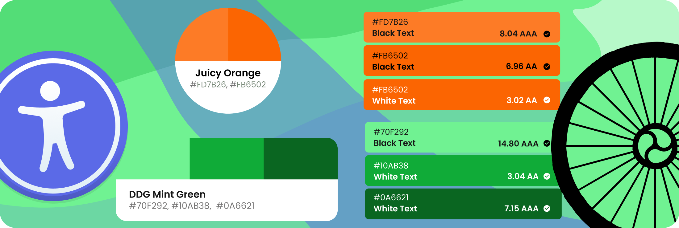
Accessible color palette chart by Dooley Design Group featuring Juicy Orange, DDG Mint Green, DDG Wild Violet, and DDG Calypso Blue, along with Shark Gray and Medium Grey neutrals. Each swatch includes hex codes and WCAG contrast ratio ratings for black and white text. This screenshot demonstrates that the color combinations are fully accessible, meeting the highest WCAG standards for readability.
Understanding Accessibility Standards
Before diving into color selection, it’s essential to understand the basics of accessibility standards, particularly those outlined in the WCAG 2 standards. The guidelines provide a framework for creating content that is not only visually appealing but also usable by individuals with various disabilities. One key aspect is ensuring sufficient color contrast, making content readable for those with visual impairments.
Contrast Ratio: The Foundation of Accessibility
Use tools like the WebAIM Contrast Checker, Colorable or the Adobe Color Contrast Checker (my favorite) to assess the contrast ratio between text and background colors. Aim for a minimum contrast ratio of 4.5:1 for normal text and 3:1 for large text (18pt or 14pt bold).
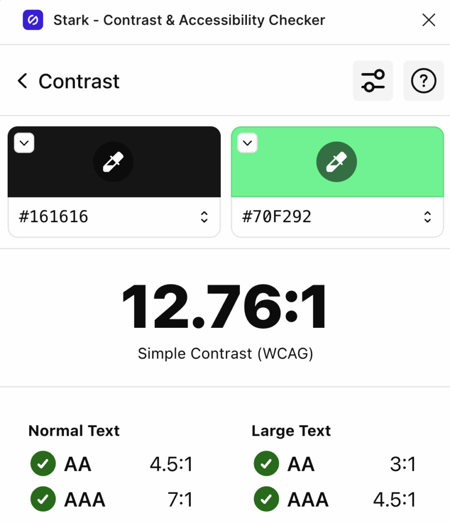
A contrast checker will tell you if it is accessible for the size of text you are using as well. Some programs also have plugins or add-ons that can check color contrast, like the Figma plugin, Stark – Contrast & Accessibility Checker.
Stark’s Contrast & Accessibility Checker in Figma, showing a color contrast ratio of 12.76:1 between black (#161616) and mint green (#70F292), passing WCAG AA and AAA for both normal and large text.
The HSL Color Space
The HSL (Hue, Saturation, Lightness) color space is often considered advantageous for crafting accessible colors, especially in comparison to RGB and CMYK.
HSL Color palette in a wheel shape. All colors match in their luminance in each ring. Complementary colors are located directly opposite each other on the wheel. For example, red and cyan or yellow and blue. These combinations naturally provide a strong visual contrast and, when spaced by at least four luminance bands, will meet the WCAG 3:1 contrast ratio.
Here’s why:
1. Intuitive Lightness Control:
In HSL, the Lightness component directly correlates with perceived brightness. This makes it more intuitive to adjust and control the brightness of colors, which is crucial for maintaining proper contrast ratios.
2. Ease of Adjusting Contrast:
HSL makes it easier to adjust the contrast between text and background colors. Modifying the Lightness value while keeping the Hue and Saturation constant allows designers to quickly enhance or reduce contrast.
3. Color Harmony:
HSL facilitates the creation of harmonious color palettes by adjusting the Hue and Saturation while maintaining a consistent Lightness. This is particularly useful for ensuring that variations in color do not compromise accessibility.
4. Simplicity in Color Manipulation:
Designers can manipulate colors more straightforwardly in HSL. For example, lightening or darkening a color is a matter of adjusting the Lightness value without affecting the overall color tone.
5. Ease of Understanding:
HSL is more human-readable and aligns with how people commonly think about and describe colors. This can make it easier for designers to communicate and collaborate on color choices.
While HSL offers these advantages, it’s important to note that the context and specific requirements of a project play a crucial role. Designers may find a combination of color spaces, including HSL, to be effective based on the project’s needs. Additionally, tools that allow for real-time visualization and testing of color choices can be invaluable in the design process, ensuring that the final color palette meets accessibility standards.
Additional Considerations
Consider Color Blindness — Design for All
Approximately 8% of men and 0.5% of women of Northern European descent have color vision deficiencies.
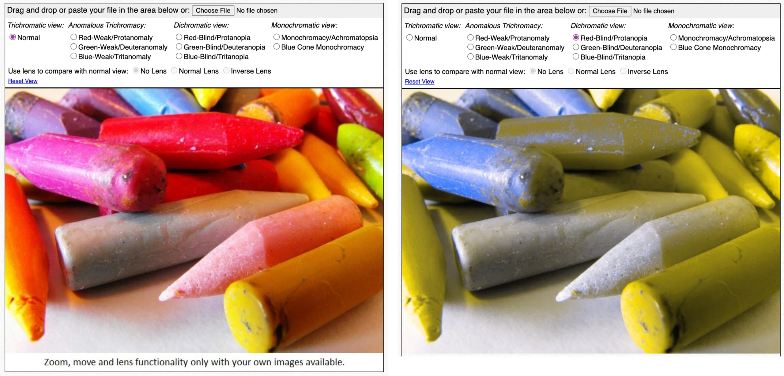
Use simulation tools like Color Oracle or Coblis to simulate how your color palette appears to individuals with color blindness.
Avoid relying solely on color to convey information; use patterns, labels, and icons to enhance understanding.
Coblis Color Blindness-Simulator showing a photo of crayons with Normal vision on the left, and on the right is a simulated image to display how a person with Red-Blind/Protanopia will see the colors.
Apply Universal Design Principles
Ensure that color is not the only means of conveying information. Use text labels, icons, and patterns to enhance clarity.
Provide multiple ways for users to navigate and understand content, catering to various learning styles and abilities.
Test and Iterate to Fine-Tune Your Palette
Regularly test your color palette using accessibility tools and gather feedback from diverse user groups.
Be open to iterating on your design based on user input and evolving accessibility standards.
Designing an accessible color palette is a critical step toward creating a digital environment that is welcoming and usable for everyone. By adhering to accessibility standards, understanding the impact of color on different visual abilities, and continuously testing and iterating, you can ensure that your content is not only aesthetically pleasing but also accessible to a diverse audience. Let’s work together to make the digital world a more inclusive space for everyone.
The Dooley Design Group team built our company an outstanding website! The message was clear, the aesthetics crisp, and overall experience of working with her team was very positive. I highly recommend their services for anyone in the market for a new website, or website upgrade.


